UI Design SaaS Company, 2024
Unifying Interfaces: Creating a Cross-Platform Design System
Created a modular design system that unified UI patterns across platforms and accelerated design-to-dev workflows.
UX + UI Design Insurance Company, 2023
Overview
This project involved designing a digital platform for a leading insurance company to streamline their management processes. Due to confidentiality agreements (NDA), specific details regarding the client and certain features are anonymized.
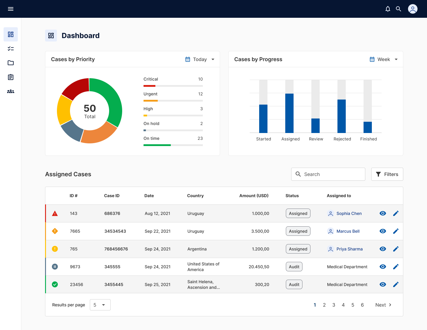
Solution & Impact: Our centralized digital platform significantly reduced manual effort, minimized errors, improved communication clarity, and enhanced overall user satisfaction, leading to demonstrable gains in operational efficiency and employee productivity.
Context and project goals
The organization faced challenges with its existing reimbursement management system. Processes were fragmented, reliant on manual tools, and prone to errors and inefficiencies. This project aimed to redesign the entire experience through a user-centered approach, leveraging design thinking principles to create an innovative digital solution that streamlined workflows and improved both user and administrator experiences.
Establishing project requirements
This phase involved outlining the product's requirements so we could analyze them and begin working on them. Key areas of focus included understanding the business ecosystem, defining the target audience, establishing the project scope and timeline, identifying business objectives and metrics, and analyzing competitor offerings. Clarity regarding stakeholder ambitions and overall business goals was crucial for validating and clearly defining the problem to be addressed.
Gathering insights and problem solving
We conducted necessary research to inform user flows and design decisions. This included competitor analysis, desktop research, and stakeholder interviews. The findings were presented and applied directly to the project, ensuring our designs were grounded in data and user understanding.
We facilitated workshops with stakeholders and employed various activities to generate ideas that addressed the identified problem. This phase included developing information architecture, creating user flows, and producing low-fidelity prototypes/wireframes. UX reviews of these wireframes ensured alignment with product manager needs.
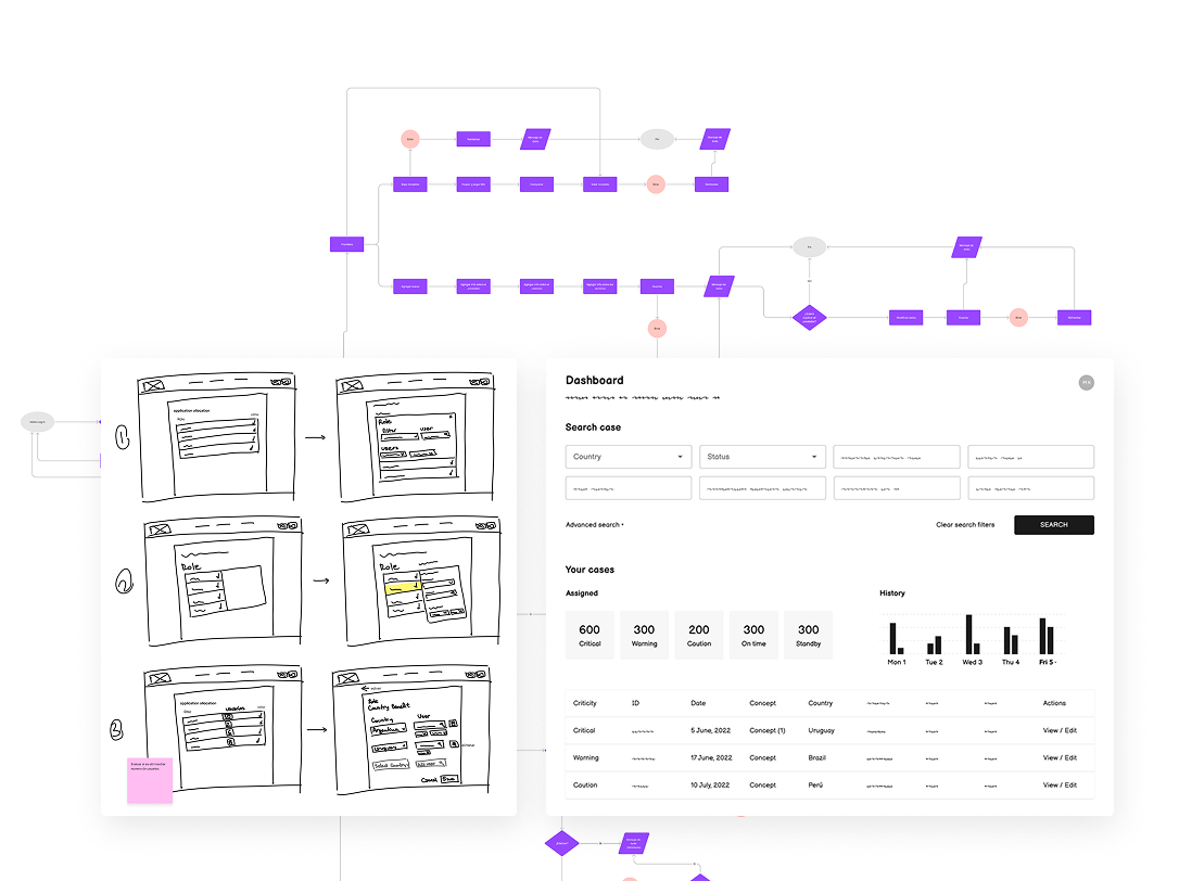
Creating a high-fidelity prototype
Based on the chosen solution, we developed a high-quality prototype incorporating the design system and adhering to the established brand manual. This prototype was shared with the product team for review and feedback.
With the high-fidelity prototype, we conducted usability testing using a structured script and gathered quantifiable data through anonymous surveys. Test results were presented to the team in a comprehensive report delivered to the product team.
The final stage involved delivering all design assets, including documentation, platform usage tutorials, and detailed handover notes, to the development team.
Post-launch, we continued to monitor usability through testing in production and analyzed user feedback and metrics to identify areas for improvement. This iterative process generated tasks that helped us refine the product over time.
Impact and outcome
The redesigned reimbursement management platform resulted in significantly streamlined workflows, reduced processing errors, and increased efficiency for both users and administrators. User feedback indicated a marked improvement in ease of use and overall satisfaction with the reimbursement process. The solution delivered on key business objectives, contributing to cost savings and improved operational performance.
UI Design SaaS Company, 2024
Created a modular design system that unified UI patterns across platforms and accelerated design-to-dev workflows.
UX Design + Accessibility Uruguay Census, 2023
Audited and improved the digital census experience to ensure it was accessible, intuitive, and inclusive for all users.
UX + UI Design Gub.uy, 2022
Designed an internal admin system to simplify complex workflows and support operational tasks.